Three easy ways to improve your calligraphy

Have you ever looked at your calligraphy and felt something wasn’t quite right …but didn’t really know what? All the letters look fine and there are no obvious mistakes yet something just feels off.
This was me just a few years ago at the start of my calligraphy journey. Frustration, confusion, despair… You name it, I felt it all! How was I supposed to get better at calligraphy if I didn’t know what was really wrong?
Fast forward a few years and I now have the answers. The good news is that these aren't random problems. They nearly always come down to three simple things. Get these working, and your writing will instantly look more polished.
Read on – here I reveal them all.
1 Stroke consistency
This is a foundational skill to learn for any style of calligraphy. It matters because your strokes, and especially your thick down-strokes, determine the natural rhythm to your text. If the downstrokes look random, some are thicker and some thinner, your eye will pick up on the inconsistency and will perceive it as something wrong.
How to improve:
Practice the basic strokes. Focus on writing the correct shape with controlled pressure. Examine anything you’ve written and check – are all the down-strokes of similar thickness?
Practising the basic strokes trains your hand to produce the same shape, the same thickness (aka pressure), the same smooth transition between thin and thick lines, over and over.
The telltale sign of improving stroke consistency is when letters you haven't consciously focused on start to look better. That's because the underlying shapes have become more reliable – your hand ‘knows’ what to do.
ELLIE'S TIP
Go slower than feels natural. Your hand and eye need to work together. Slowing down gives your eye time to intentionally ‘guide’ your hand. With practice this becomes muscle memory.
2 Slant consistency
You can have beautiful individual strokes and still have writing that looks shaky or unsettled – and slant inconsistency is usually the reason. When your downstrokes lean at slightly different angles across a line, the eye registers it as wobbliness even if it can't quite identify why.
Slant is about training your your hand to write every letter at the same angle. In Copperplate, a consistent slant of 55° gives the script its elegance.
In modern calligraphy, the slant can be more relaxed, but it still needs to be your consistent slant. Whatever angle you choose, it should appear reliably throughout your work.
ELLIE'S TIP
Think of the upstrokes and downstrokes as a push and pull move. Now simply rotate the practice sheet to make it easy for your hand to naturally do these push-pull moves at the correct angle for your script.

3 Letter spacing
Consistent letter spacing is what gives calligraphy its flow and draws the eye across the page. When spacing is uneven, work can look crowded in some places and gappy in others. Even well-written letters lose their elegance if they are spaced badly.
Changing the spacing can completely overhaul the feel of your text, even if everything else (letter shapes, slant) remains the same. Bump up the spacing, and your formal paragraph starts to look to airy and delicate.
There is no right or wrong amount of space, but consistency is key. If you want to instantly elevate the look of your calligraphy, simply practice consistent spacing.
What makes it slightly tricky is that spacing is not mechanical. All letters are different and so you can’t just measure equal gaps between them all. Instead aim for consistent optical space.
How to improve:
Pay close attention to the white space between the letters. This is one of the most overlooked aspects of calligraphy practice. Round letters next to each other will need slightly less space than ‘straighter’ letters like ‘tt’ sitting together.
Getting this right takes time and practice. But observing the white space between the letters is the necessary first step.
ELLIE'S TIP
Try flipping your practice sheet upside down and looking at it. This forces your eyes to look at the pattern of shapes and gaps, rather than reading the letters. Any uneven spacing will be easier to spot.
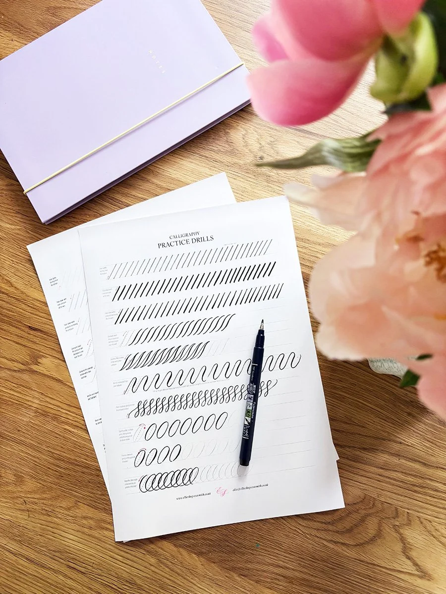
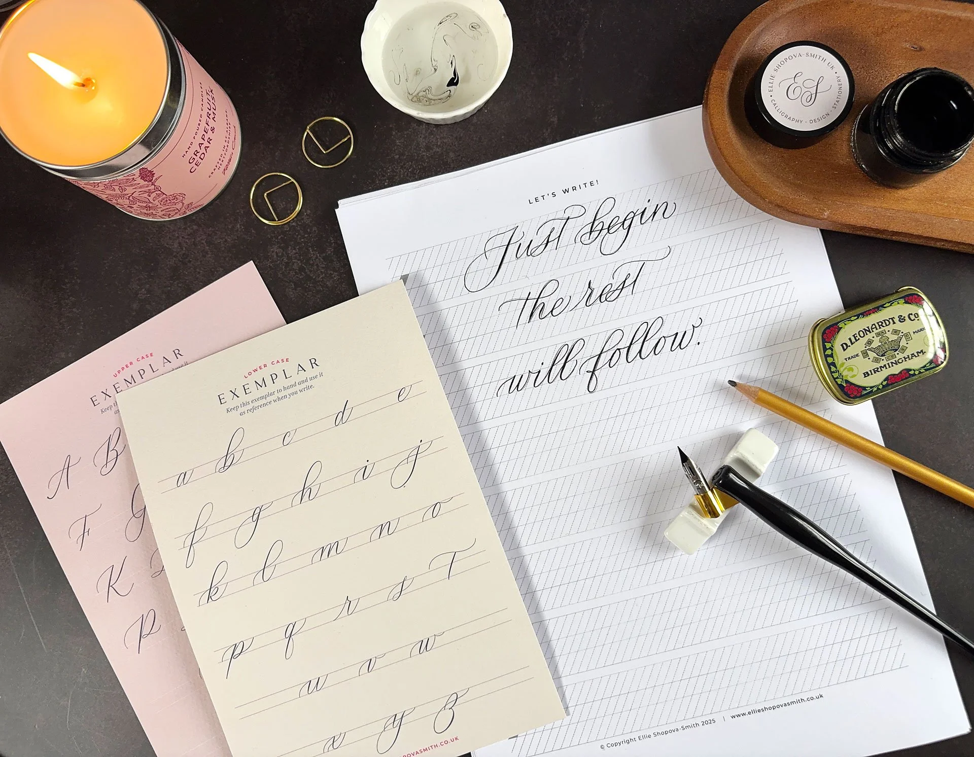
Free printable practice sheet
To help you master stroke, slant and spacing consistency, I have prepared a small gift for you. Grab it free in my Subscribers area.
Simply sign up to my newsletter to get access. Print it, pick up your pen and let’s go!
Stroke + slant + space consistency = instantly better calligraphy!
The reason these three areas matter so much is that they build on each other. Work on stroke consistency and your slant becomes easier to keep. Work on slant and your spacing starts to improve. Dedicated practice in each area compounds over time.
Remember you don't need long practice sessions. Ten focused minutes a day, working through these three areas, will build muscle memory faster than an unfocused hour. Keep it enjoyable, keep it curious, and trust the process.


If you'd like structured guidance on learning calligraphy, I teach beginner calligraphy workshops in Halifax.
Explore workshops →
In my online shop you can find calligraphy practice workbooks with plenty of practice built in.
Browse calligraphy worksheets →